Name
PS Basic™ (1200)
Year
2016–2023
Role
Typeface system,
Digital identity
Category
Typography
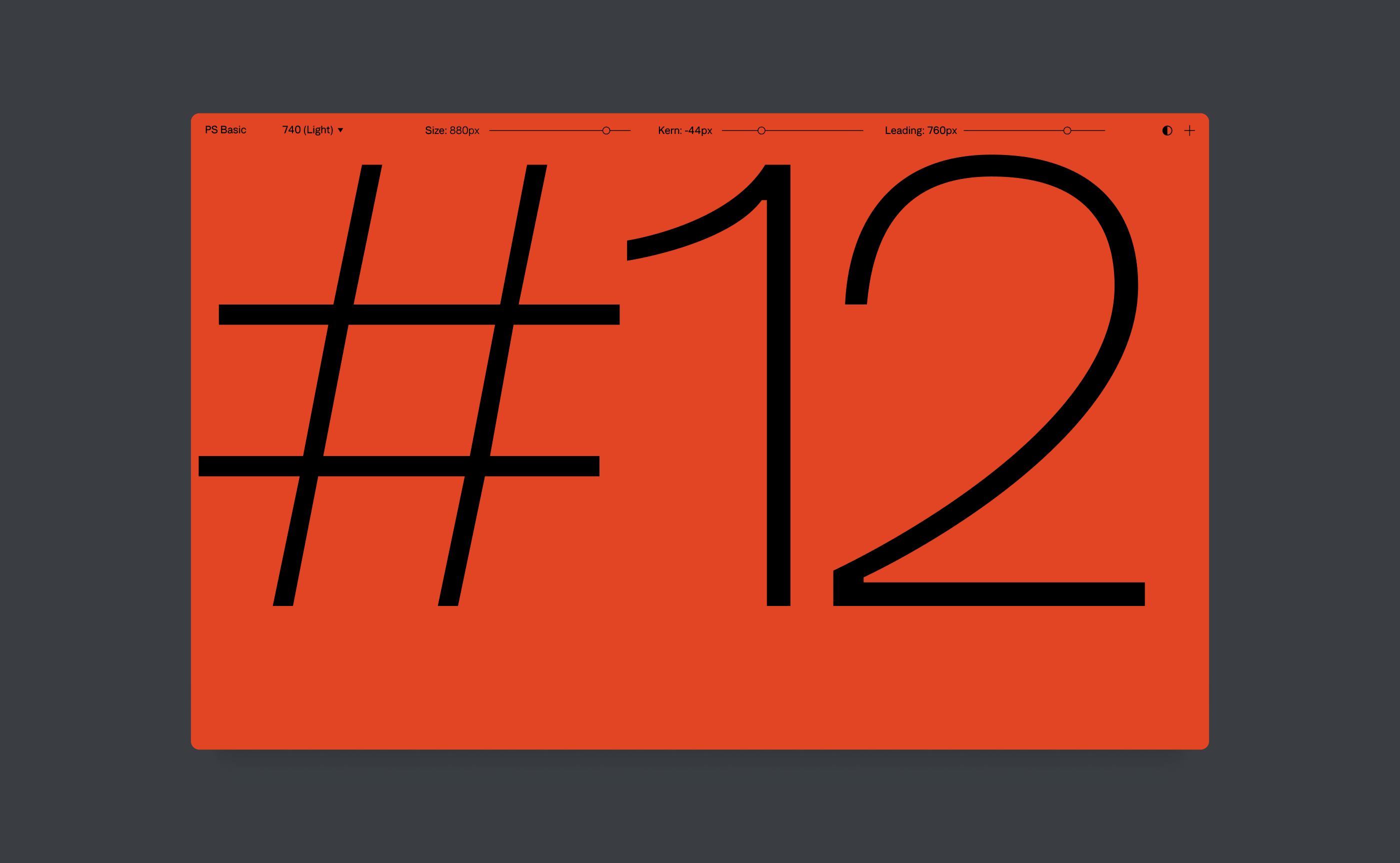
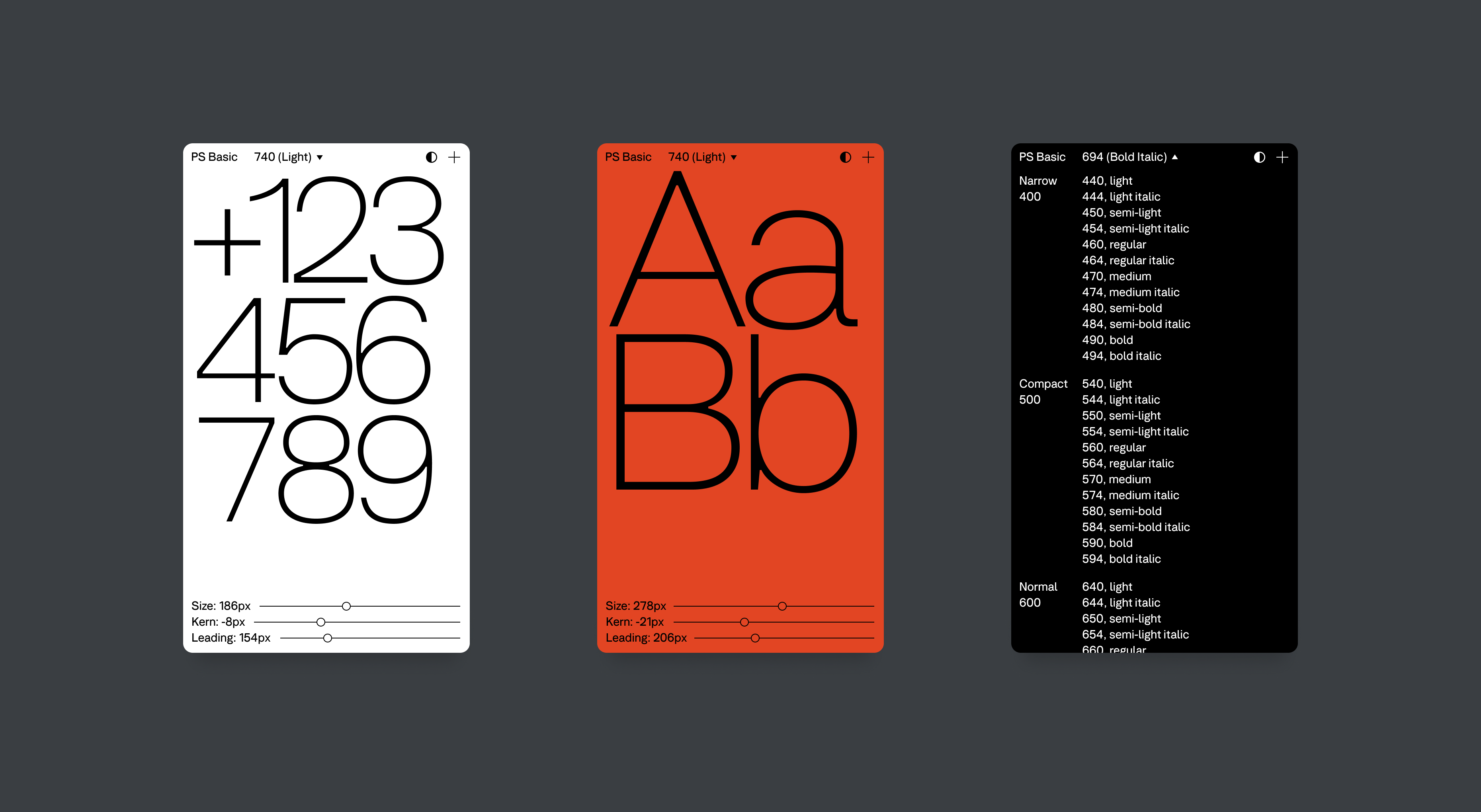
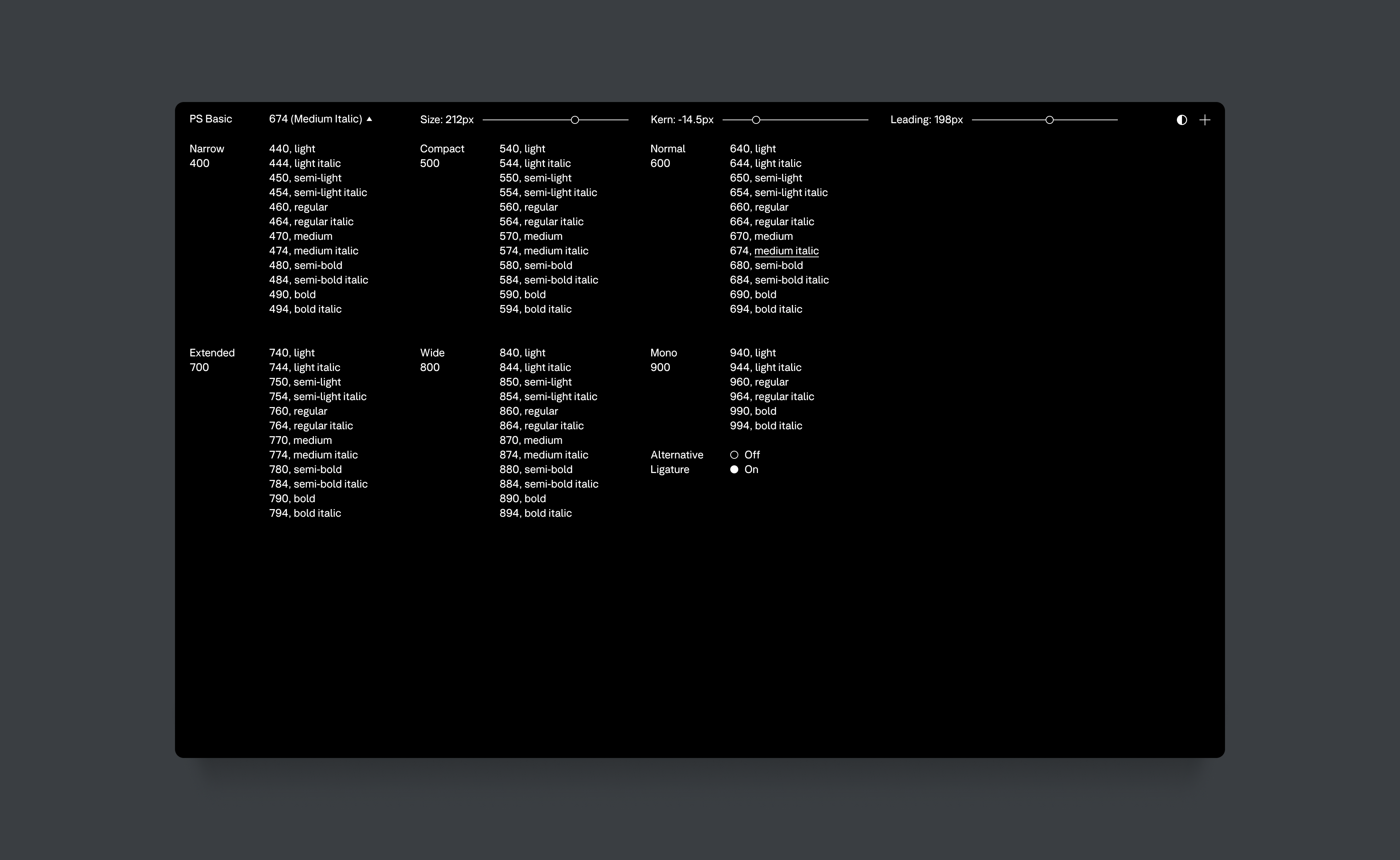
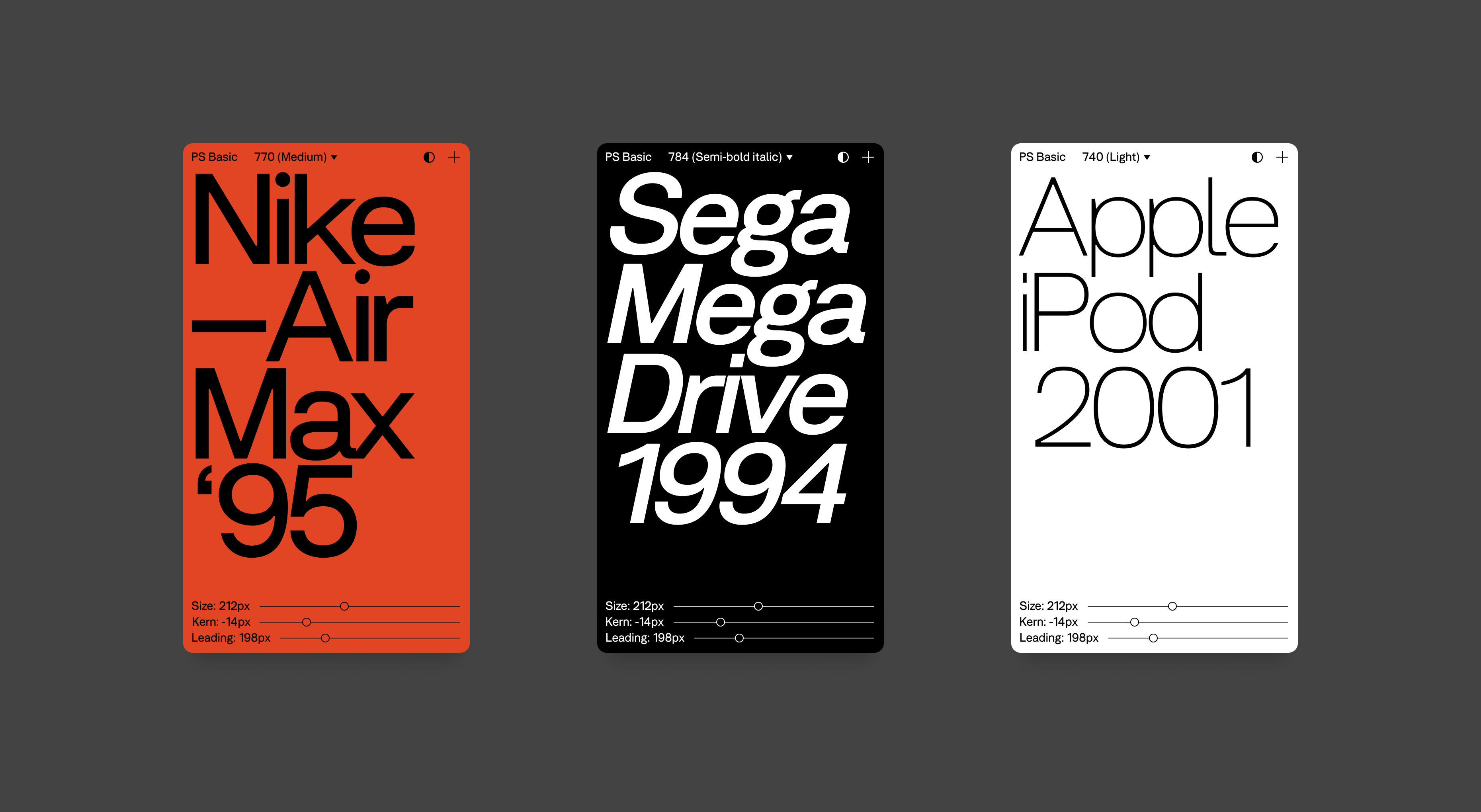
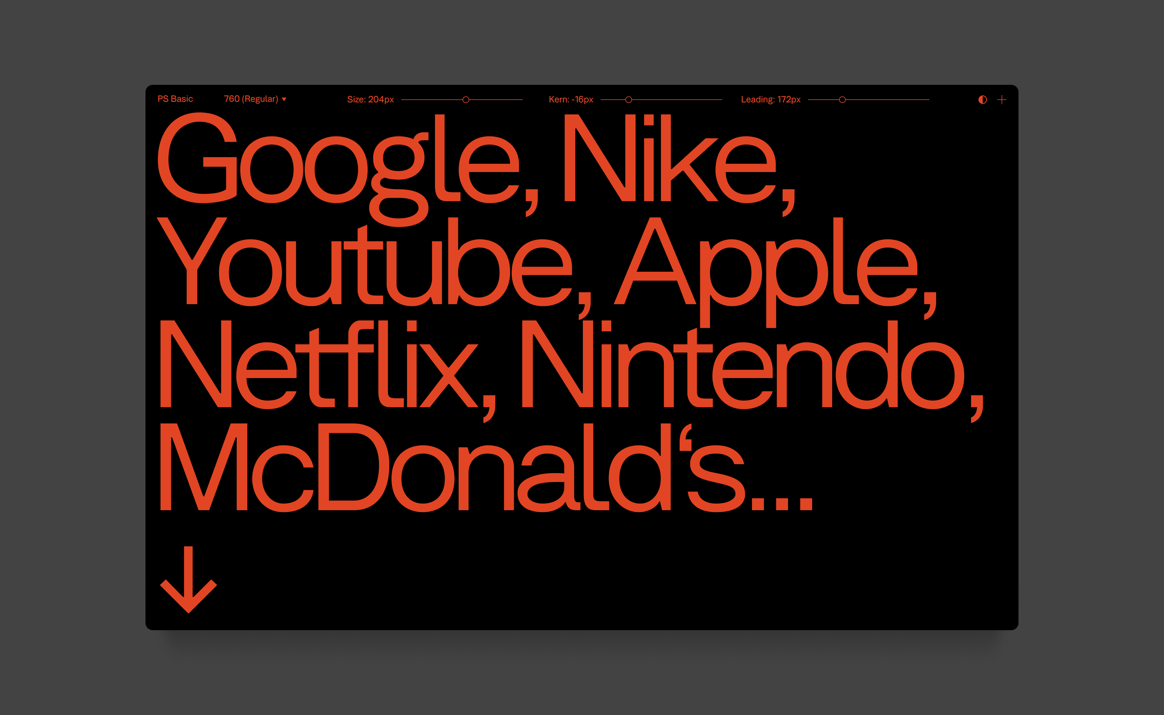
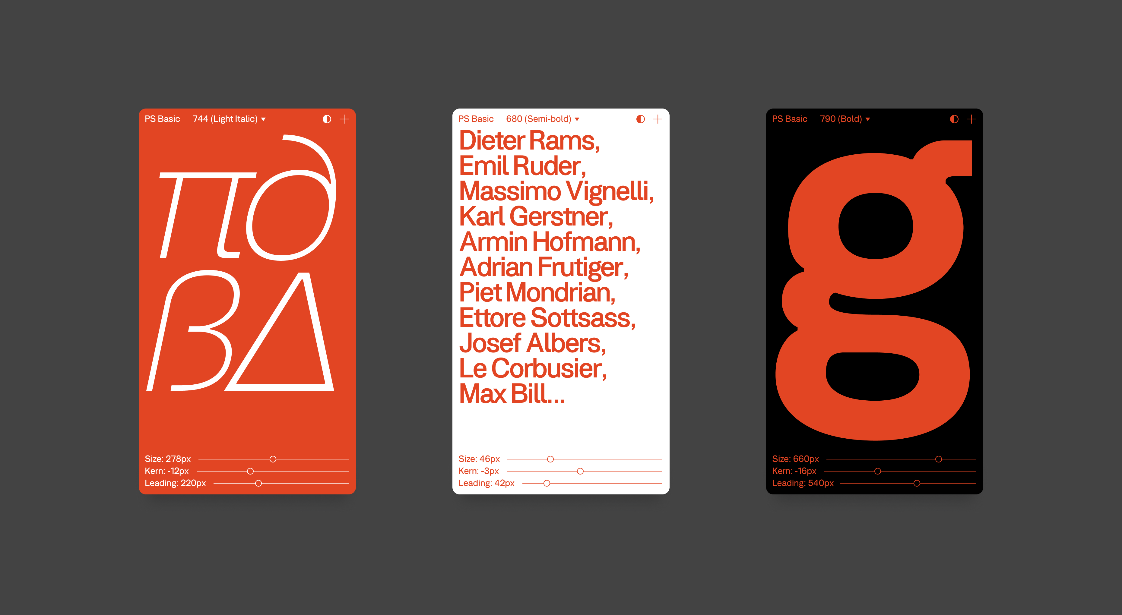
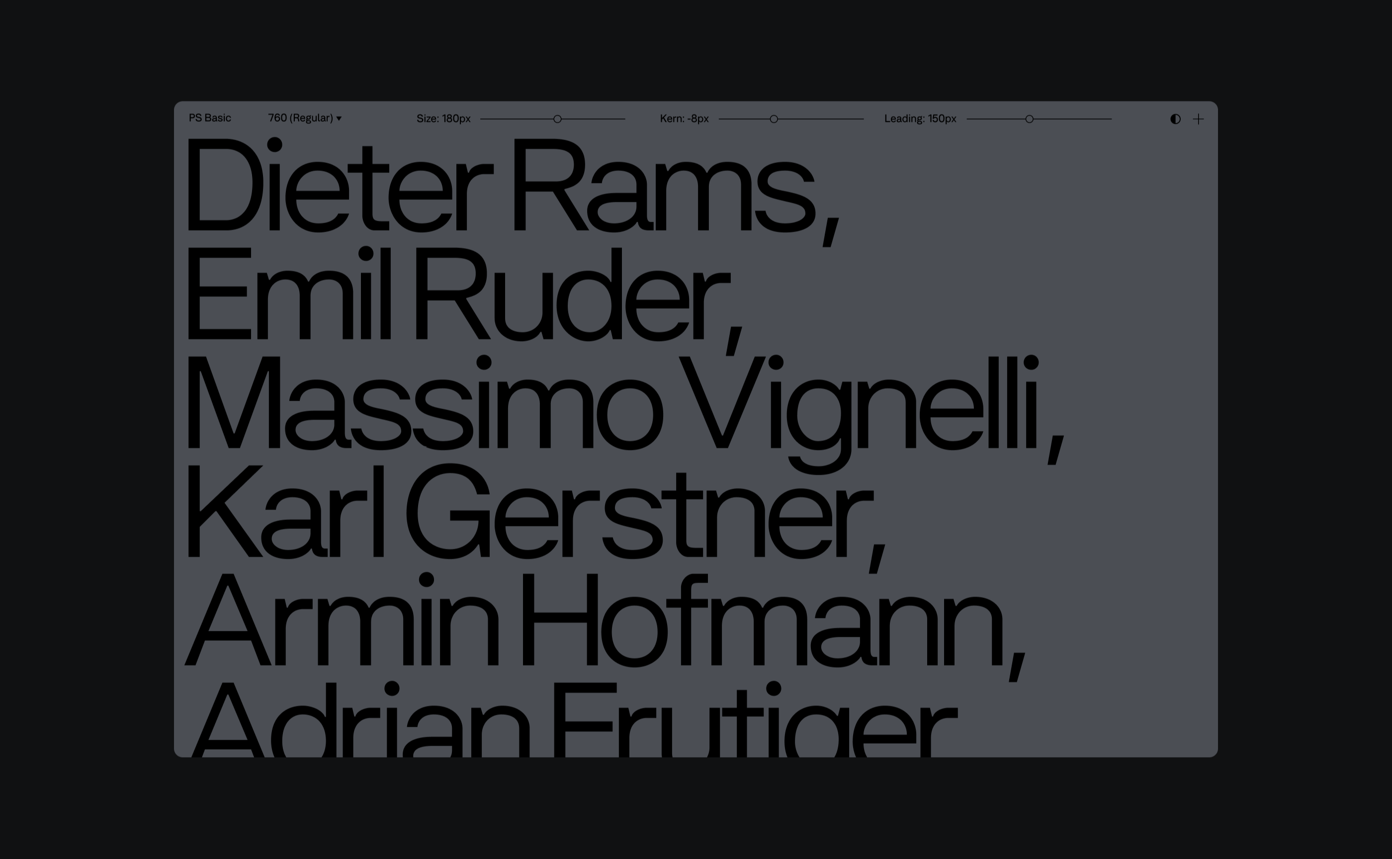
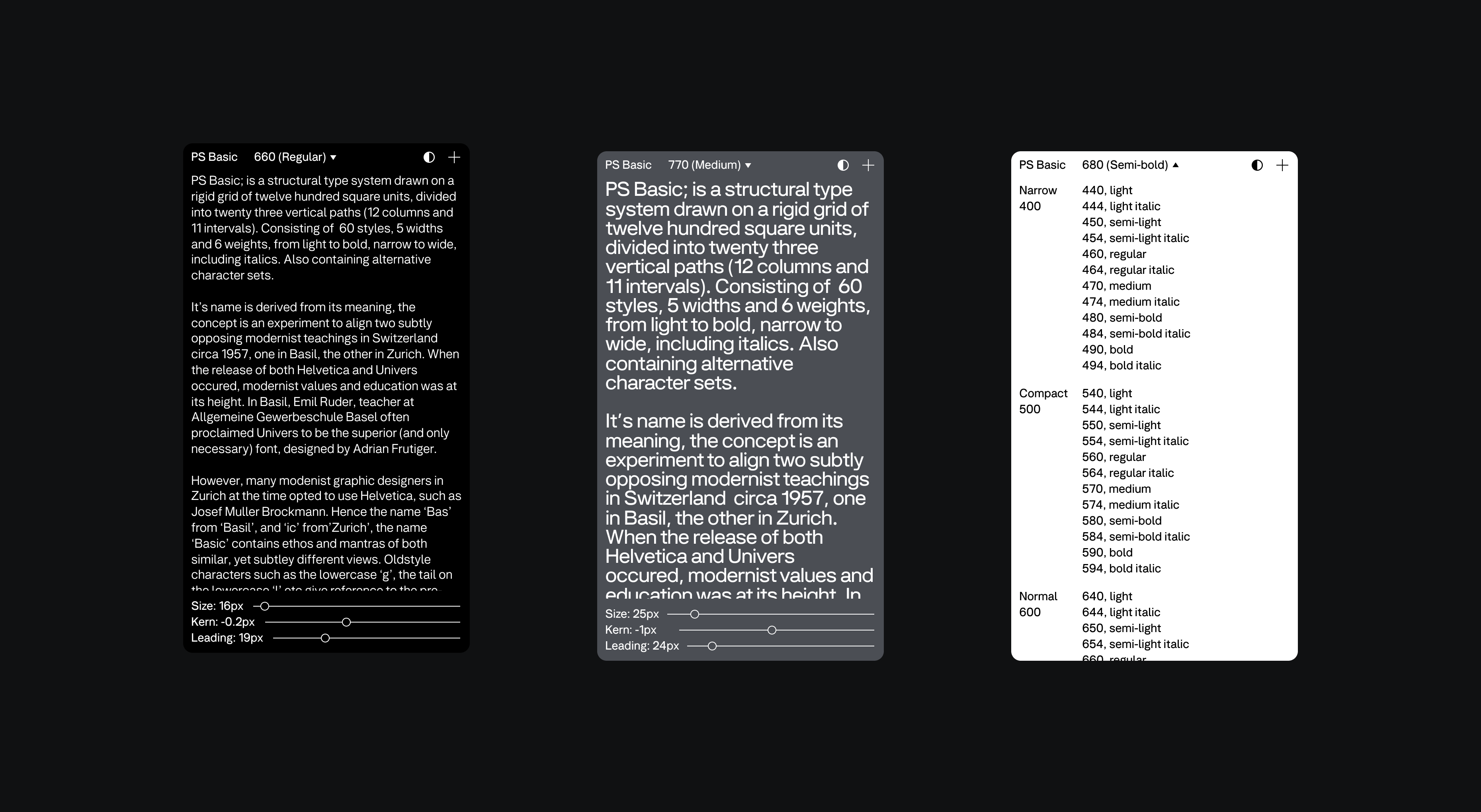
PS Basic; is a structural type system drawn on a rigid grid of twelve hundred square units, divided into twenty three vertical paths (12 columns and 11 intervals). Consisting of 60 styles, 5 widths and 6 weights, from light to bold, narrow to wide, including italics, diacritics for language support, and containing alternative character sets.
The name is derived from its conceptual purpose, the purpose is to produce an experiment that aims to align two subtley different modernist approaches circa 1957 in Switzerland. The release of Univers by Adrian Frutiger gained popularity in Basel, while Helvetica was preferred as the primary font in Zurich.
The letters ‘Bas’ from ‘Basil’, and ‘ic’ from ‘Zurich’, the name ‘Basic’ contains ethos and mantras of both similar, yet subtley different approaches. Oldstyle characters such as the lowercase ‘g’, the tail on the lowercase ‘l’ etc. give reference to the pre-and-post war era, while appearing classical yet enhancing readability through their difference in form.
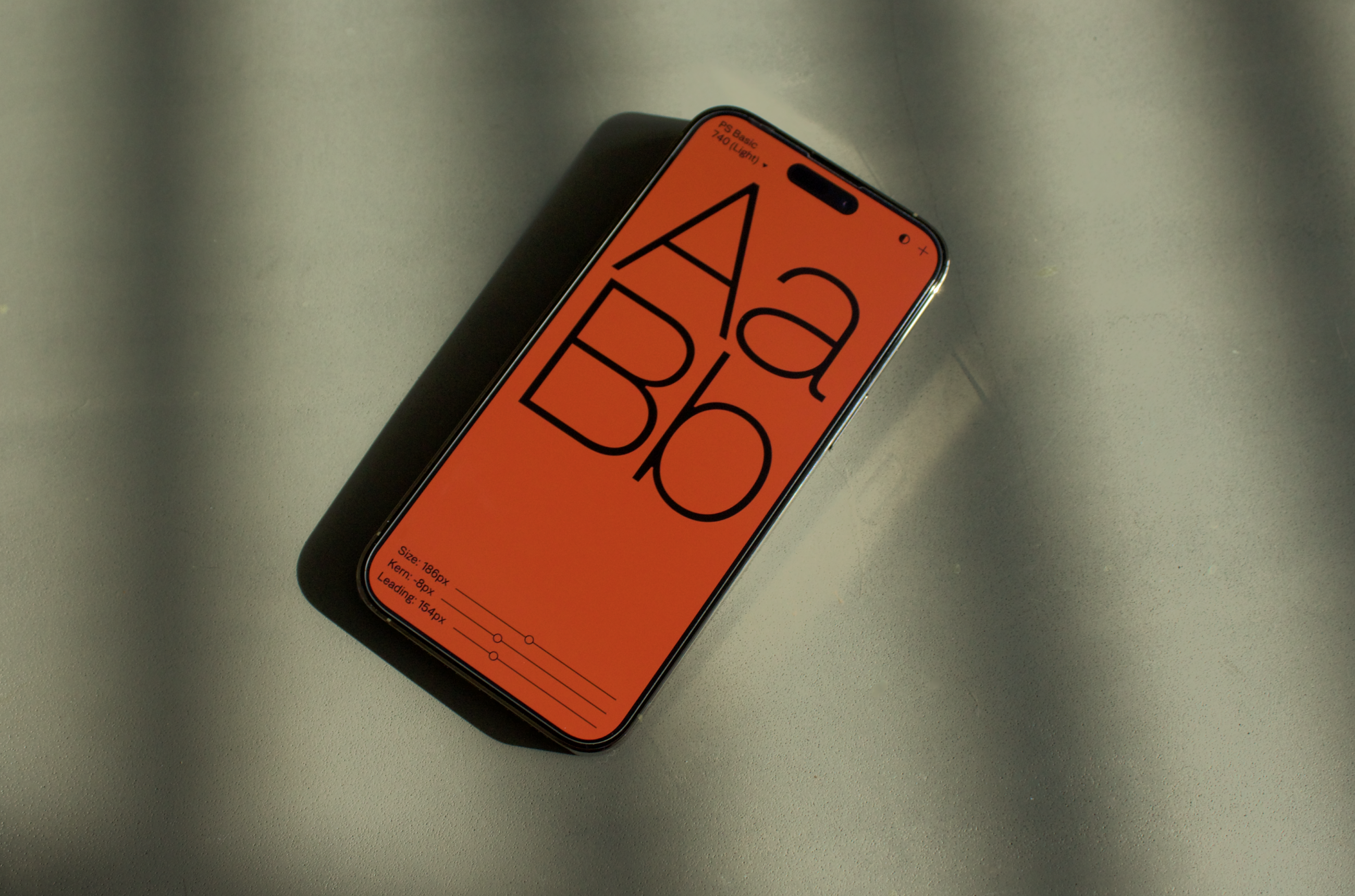
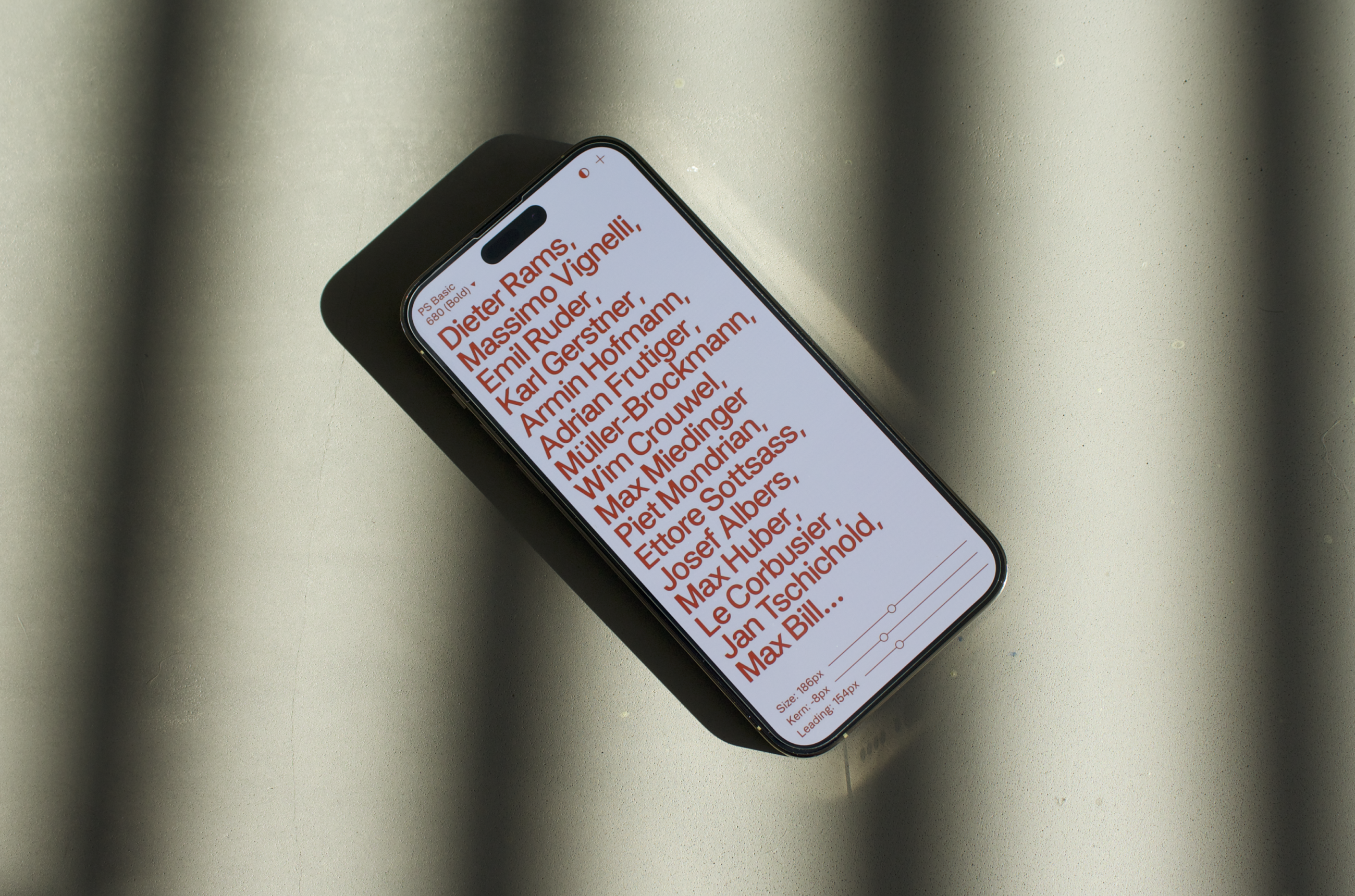
The digital interface is designed to give users tools for interacting with the font, expressing the depth and variety of styles available. Enabling users to change the size, kerning and leading values with range sliders, and also to change the font widths, weights, textual input and the colour of the backgrounds.